#KHStudy for Polished + Raw (Brand Identity & eBook Reveal)
Polished and Raw embodies the beauty of crystals with the intention to be raw, authentic, and present.
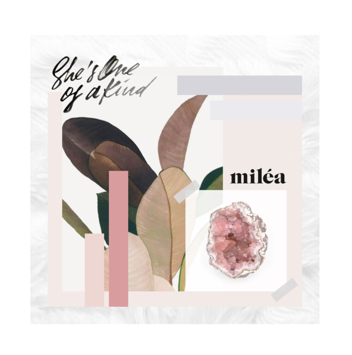
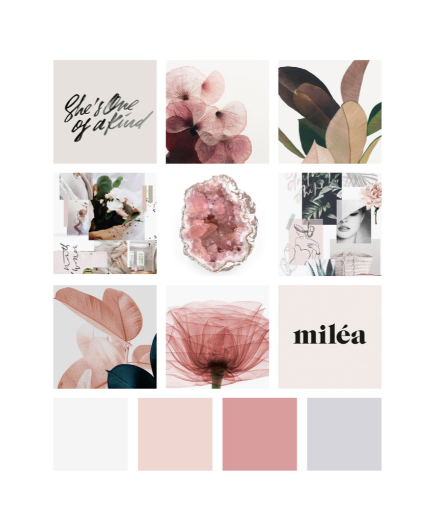
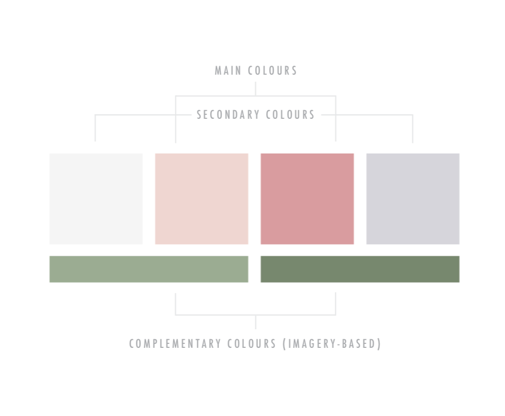
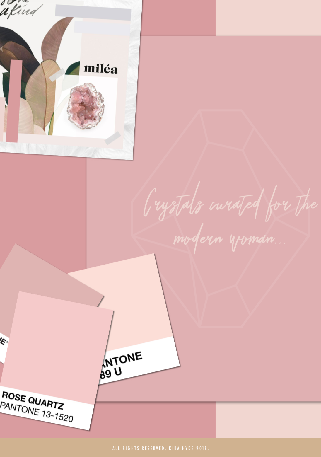
Phase One: Moodboard & Colour Palette
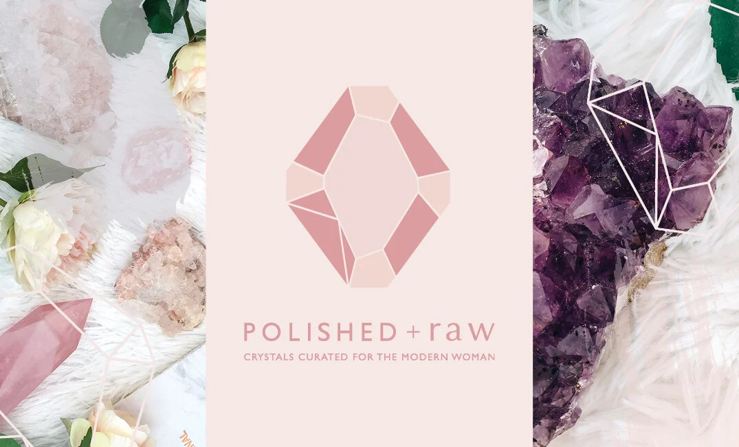
Phase Two: Main Logo & Variations
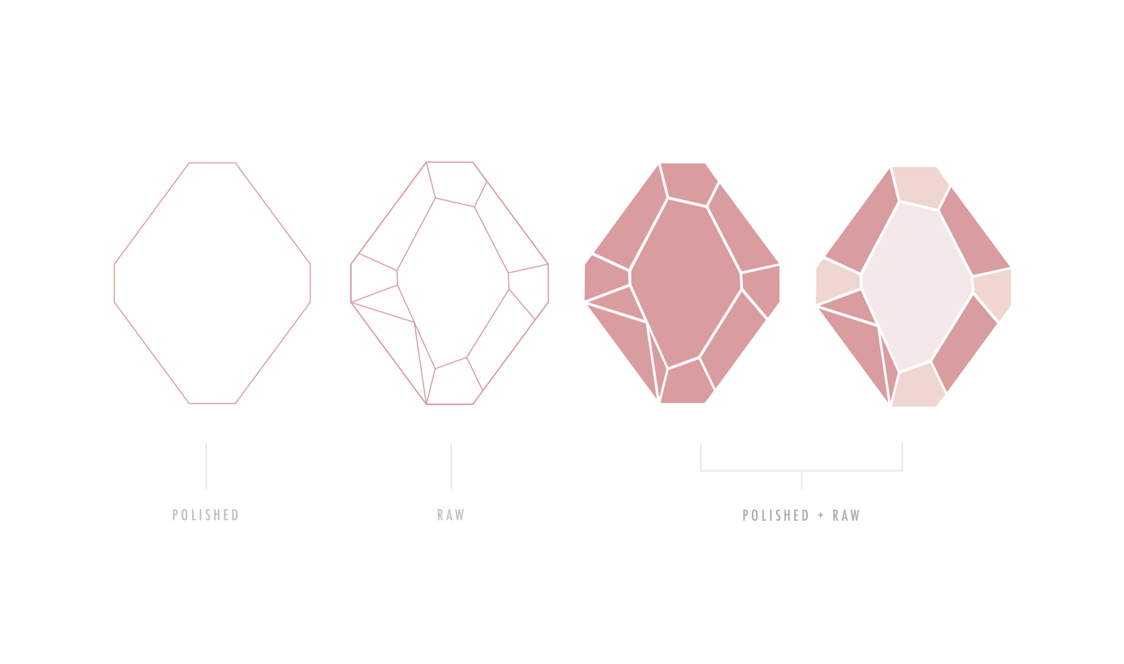
Polished refers to the beauty of crystals coupled with the elegance of today’s modern woman.
Raw refers to the authenticity and openness that comes from removing the layers we often stow upon ourselves.
There are also two essential types of crystals – polished: (spheres, points, tumble stones, etc), and then raw; (clusters and roughs).
Polished and Raw embodies the beauty of crystals and the women around us, with a reminder to be authentic and true to ourselves.
Phase Three: Brand Board
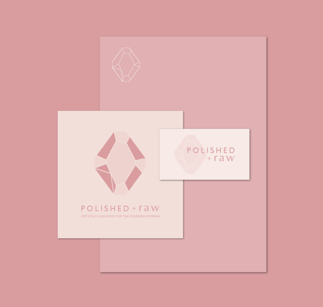
Phase Four: Brand Collateral
Strategy: Two Weeks of Brand Goals Sessions & PDF Outline/ Overview


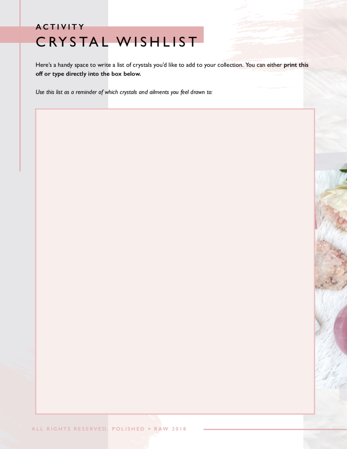
Extras: eBook (Sneak Peek)



#KHBEHINDTHESCENES
A Re-brand that altered everything.
The Background: Crystals New Zealand (Polished + Raw before) has been one of New Zealand’s biggest online store for Crystals and Crystal Products BUT they were lacking that point of difference that set them apart from their competitors.
The Brief: The official Brief was established during our Brand Goals Sessions, we spent two weeks researching, brainstorming and strategising how to build a new brand from the ground up that would be game-changing for not just their biz, but for their customers too.
Including: Brand Goals Sessions (2 Weeks of Brand Strategy Sessions & Final Strategy Outline), Main Logo, Variation Logos, Submarks, Colours, Typography, Patterns & Elements, Moodboard, Brand Board, Style Guide, Business Cards, eBook etc.
The Results: A Re-brand like no other, one that was born out of a passion to help women all over the world, serving a community of women through storytelling, mindfulness and selfcare. A brand that removes the stigma surrounding crystals and strips it back to something timeless that personifies both crystals and a need for authenticity and openness.
